Data Bars, In-Cell Visual Value Bars
Data Bars overlay a proportional horizontal bar behind the number in any numeric Gravity Forms column, giving readers an at-a-glance sense of magnitude without disrupting the underlying value that drives exports, totals, inline editing, or conditional formatting.
Requires TableCrafter Pro. Data Bars are a Pro-only feature available from v6.3.5. The option is hidden in the table builder and the bar rendering is suppressed server-side if your license is not active. Upgrade or start a free trial under WP Admin → TableCrafter → Upgrade.
What Data Bars are and how they work
A Data Bar is a pure CSS underlay that fills a fraction of a table cell's width proportional to the cell's value relative to the column maximum on the current page. The bar is rendered by a ::after pseudo-element driven entirely by two CSS custom properties that TableCrafter writes onto every <td>:
--gt-bar-pct, a value between0and1representing the cell's share of the column maximum.--gt-bar-color, the hex or CSS color string you chose in the column builder.
The cell also receives a data-gt-bar-pct HTML attribute containing the same ratio, which lets you target it from your own CSS selectors. Because the bar lives in a pseudo-element behind the cell content, the number visible to users, screen readers, copy-paste, and every downstream feature (exports, totals, inline editing, conditional formatting) remains the raw, unmodified value from Gravity Forms. There is no wrapper markup injected inside the cell.
Data Bars only activate on numeric Gravity Forms field types: Number, Quantity, Total, and Calculation. Mapping a text or date field to a bar-enabled column has no effect, the bar simply does not render.
Column maximums are computed fresh on every page load and re-computed on every paginate or filter change. From v7.2.0 onward, TableCrafter can instead return the maximum across the entire filtered result set, not just the current page, so bars stay proportionally consistent as you page through a large dataset. See Server-Side Processing and SSP Mode below for details.
Enabling Data Bars in the table builder
Data Bars are configured per column, not globally. Open the table configuration in WP Admin → TableCrafter, then:
- Click the column row you want to configure to expand it, then click the gear icon to open the field modal.
- Switch to the Display tab inside the modal.
- Toggle Show data bar on. A color picker appears immediately below the toggle.
- Pick your bar color. The picker accepts hex values directly if you want to match a brand color precisely.
- Optionally expand the Bar Options section to enable any of the visual sub-options described in the next section.
- Click Save Column, then Save Table. Bars will appear on next page load.
You can enable bars on multiple columns in the same table simultaneously. Each column keeps its own independent color and maximum, a "Miles Driven" column and a "Load Weight" column can each have bars without interfering with each other's scale.
Visual sub-options (v7.5.0)
Beyond the base solid bar, four visual modes can be combined freely per column. All are toggled from the same Bar Options section in the field modal.
Label (show_label)
When enabled, the cell value is rendered inside a <span class="gt-bar-label"> element that floats above the bar underlay. This keeps the number legible even when the bar fills a large portion of the cell. Without this option the number sits in normal flow and the bar renders strictly behind it, for most column widths and color choices this is fine, but narrow columns with high values can benefit from the explicit label layer.
Gradient (gradient)
Switches the bar fill from a solid rectangle to a linear-gradient(90deg, color 0%, transparent 100%). The effect is a fade-to-transparent toward the right edge, which reduces visual weight and makes dense numeric tables feel less busy. Gradient mode pairs especially well with darker brand colors where a solid fill across 80 - 90% of a cell would be distracting.
Bipolar axis (bipolar)
Standard bars assume all values are positive, anchoring at the left edge and growing right. Bipolar mode centers the bar on a zero axis: positive values grow right, negative values grow left from center. The CSS property driving bipolar bars is --gt-bar-signed-pct (a value between -1 and 1) rather than --gt-bar-pct. Use this for columns like profit/loss, temperature deviation, or any metric that can run negative.
When bipolar mode is active, --gt-bar-pct is still written on the <td> as the absolute ratio for any custom CSS that needs it. --gt-bar-signed-pct is the additional signed variable used by the bipolar ::after rule.
Sparkline (sparkline)
Sparkline mode collects the values in the column into a per-column series array (_barSeries) and renders an inline SVG <polyline> element alongside the bar underlay. The result is a miniature trend line inside the cell showing how the value relates to the sequence of values in the column, useful for time-ordered datasets like weekly load counts or monthly revenue rows.
How bars scale: page maximum vs. filtered-set maximum
By default, --gt-bar-pct for each cell is computed as cell_value / max_value_on_current_page. This means the tallest bar on any given page always fills 100% of the cell width. When you paginate, bars rescale to the new page's maximum.
From v7.2.0, TableCrafter can return the maximum across the entire filtered result set from the server, so a value of 8,400 on page 3 still renders at the same proportional width as 8,400 on page 1, even if the overall maximum is 12,000. This is the recommended setting for any dataset where cross-page comparison matters.
The server-supplied max is returned in the AJAX response as bar_maxes (a per-column map). The frontend uses that value when present and falls back to the page-scoped max when absent, so the feature degrades gracefully on older Pro builds.
Advanced modes: SSP, pivot view, and RTL
Server-side processing (SSP) mode (v7.4.0)
When your table uses server-side pagination, a requirement for very large Gravity Forms entry sets, bar percentages are computed server-side by GT_Data_Bars_Service::parse_numeric() before the page payload is sent. The service handles locale-aware numeric parsing (see the EU-decimal section below) and returns bar_maxes in the same AJAX response as the row data. No extra round-trip is needed.
Pivot view (v7.3.0)
Pivot view rotates the table so that Gravity Forms fields become row headers and entries become columns. Data Bars work in pivot view via computePivotBarMaxes(), which recalculates maximums along the pivoted axis. Aggregate summary columns (sum, average, count) in pivot view also receive bars, letting you spot outlier aggregates at a glance.
RTL support (v7.4.1)
When TableCrafter detects a right-to-left page (via the .gt-rtl class on the table wrapper), the bar underlay is mirrored: the ::after pseudo-element anchors to the right edge of the cell and grows left. No configuration is required, RTL is detected automatically from the WordPress text direction setting.
The relevant CSS override in TableCrafter's stylesheet:
/* RTL bar anchor (auto-applied via .gt-rtl) */
.gt-rtl .gt-table tbody td[data-gt-bar-pct]::after {
  right: 0;
  left: auto;
}
Automatic suppression
Data Bars are suppressed automatically, no bar is rendered, and no CSS variables are written, in the following contexts to prevent visual conflicts:
- Card (responsive stacked) view and full responsive view
- Pivot view cells that are not numeric aggregate columns
- Auto-merged cells (cells that span multiple rows via
rowspan) - Toggle, file, image, link, and raw HTML cell types
- Any cell that already has a background color applied via conditional formatting
EU-decimal and locale-aware numeric parsing (v7.0.3)
Gravity Forms can store numbers in European locale formats where a period is the thousands separator and a comma is the decimal separator, for example, 1.234,56 instead of 1,234.56. Currency symbols may also be present, such as €1.234,56.
TableCrafter's bar-percentage computation runs all values through a locale-aware parser before comparing them. The parser strips recognized currency symbols, detects whether the last separator is a comma or a period to determine which is the decimal, and produces a clean JavaScript Number for the max calculation. The conversions handled are:
| Raw Gravity Forms value | Parsed as |
|---|---|
| 1.234,56 | 1234.56 |
| €1.234,56 | 1234.56 |
| 1,234.56 | 1234.56 |
| $1,234.56 | 1234.56 |
| 1234 | 1234 |
If the parser cannot resolve a value to a finite number it treats that cell as zero for bar-scaling purposes. The displayed cell value is never modified.
CSS customization with var(--gt-bar-pct)
Because bars are driven entirely by CSS custom properties, you can override every aspect of their appearance from your theme's stylesheet or a custom CSS block in the WordPress Customizer without touching PHP or JavaScript. Target the [data-gt-bar-pct] attribute selector to scope overrides to bar-enabled cells only.
Changing bar height and border radius
/* Thinner bars with rounded ends */
.gt-table tbody td[data-gt-bar-pct]::after {
  height: 4px;           /* default fills full cell height */
  bottom: 6px;           /* pin to bottom of cell instead of filling */
  top: auto;
  border-radius: 2px;
  width: calc(var(--gt-bar-pct) * 100%);
}
Two-tone threshold coloring
CSS custom properties can be overridden inline. If you want bars to turn red above 80% of the column max, for example, on a load weight column approaching vehicle capacity, you can combine a CSS @property registration (for browsers that support it) with a color-mix() expression, or use a simpler class-based approach via a PHP filter that writes an inline style on the <td>:
/* Override bar color for high-value cells via an inline style
   written by the gt_bar_cell_attrs filter */
.gt-table tbody td[data-gt-bar-pct].gt-bar-high::after {
  --gt-bar-color: #ef4444;   /* red for cells above threshold */
}

.gt-table tbody td[data-gt-bar-pct].gt-bar-mid::after {
  --gt-bar-color: #f59e0b;   /* amber for mid-range cells */
}
Custom bar label typography
/* Style the label span (requires show_label enabled) */
.gt-table tbody td[data-gt-bar-pct] .gt-bar-label {
  font-weight: 600;
  font-size: 13px;
  position: relative;   /* ensures label sits above ::after pseudo-element */
  z-index: 1;
}The bar ::after pseudo-element uses position: absolute with left: 0; top: 0; bottom: 0 and z-index: 0 by default. Your cell content (including the .gt-bar-label span) must have position: relative; z-index: 1 to reliably appear in front of the bar. TableCrafter sets this automatically on td when a bar column is active, but if you override position on the td in your theme CSS, add those rules to your label span as a fallback.
Interaction with other Pro features
Data Bars are designed to coexist with every other TableCrafter Pro feature without configuration:
- Inline editing, when a bar-enabled cell enters edit mode, the bar underlay is hidden automatically so the editor input is unobstructed. The bar reappears after the edit is committed.
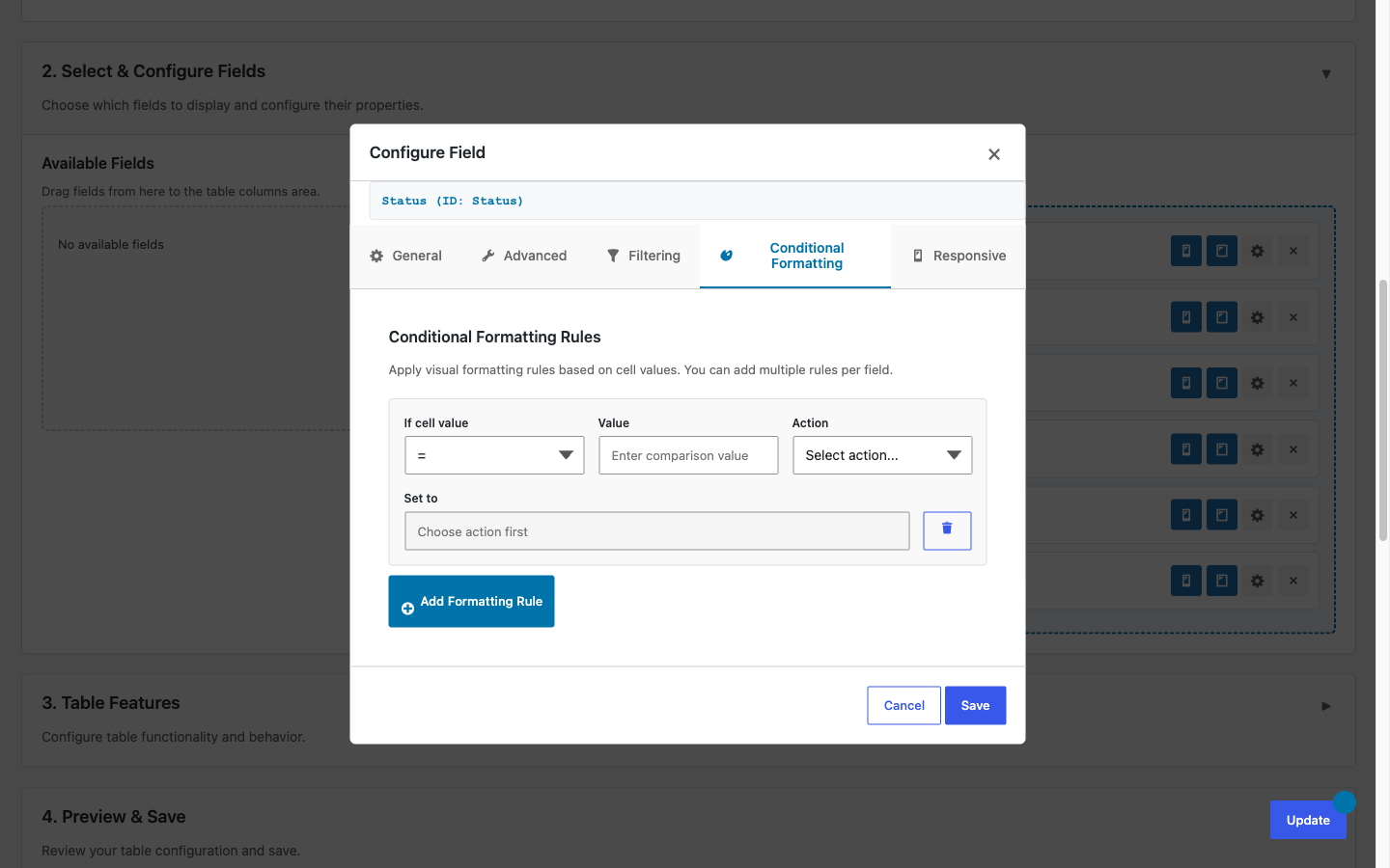
- Conditional formatting, if a conditional formatting rule applies a background color to a cell, the bar is suppressed for that cell only. The bar continues rendering on all other cells in the column.
- Data export, exported files (Excel, CSV, PDF) receive the raw numeric value from Gravity Forms. No bar markup, no
data-gt-bar-pctattributes, and no percentage annotations appear in exports. - Column role visibility, a column hidden from the current user's role is fully suppressed, including its bar configuration. No CSS variables for that column are written to the DOM.
- Entry duplicate, duplicating an entry duplicates the underlying Gravity Forms entry. The bar for the new row is computed automatically on the next render pass.